UI / UX Design
Blinkist Onboarding Audit & Redesign
A self-initiated UX/UI case study analyzing onboarding friction, cognitive load, and account capture strategy in the Blinkist mobile experience.
Year :
2026
Industry :
EdTech
Client :
Self-initiated redesign concept
Duration :
2 week
Team :
Solo
Challenge :
Blinkist already delivers clear product value. However, the first onboarding session introduces multiple friction points before users fully understand why they should continue. This case study explores how onboarding structure, messaging hierarchy, account timing, and pricing presentation could be simplified to create a clearer path to activation.
PROBLEM DIAGNOSIS
Problem 1: Current onboarding asks too much, too early.

Core insight:
The flow requires visual processing, decision-making, and category selection before delivering value or capturing the account.
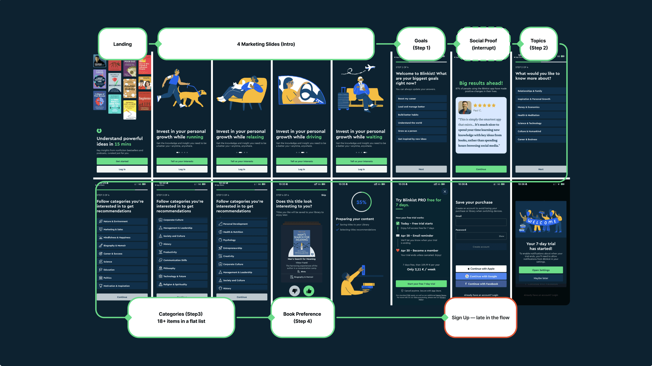
The intro is one animated screen with four lifestyle variations. The headline and CTA never change.
The user completes 4 onboarding steps with 30+ selections before sign-up — introducing high cognitive load before value is established.
Drop-off at any point means the user is lost. No email captured means no re-engagement possible.
SOLUTION
Reordering the flow around progressive commitment.
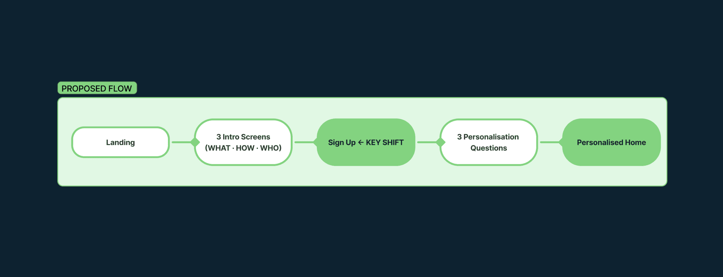
The redesigned flow captures the account earlier and delivers personalisation as a follow-up, not a precondition.
introduce → demonstrate → prove → register → personalize
Many modern consumer apps prioritise account capture early in the onboarding flow, using personalisation as a follow-up rather than a prerequisite.
An incomplete profile remains addressable through email and re-engagement. A lost user does not.
Problem 2: Landing Screen
First screen, first impression, first friction.
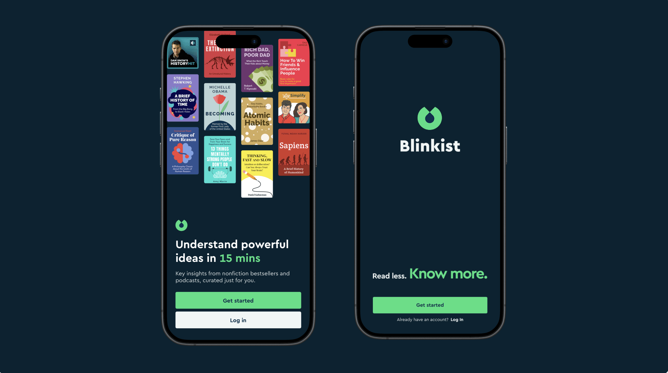
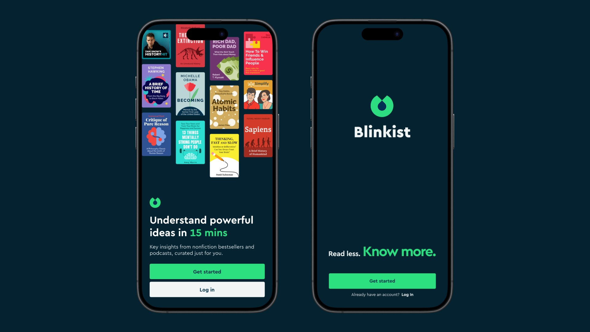
12 covers, two equal-weight CTAs, and a generic headline compete for attention before communicating why the user should stay.
Two equal-weight actions create decision friction at the worst moment — before the user understands the product. Hick's Law: more choices, slower decisions.
"Understand powerful ideas in 15 mins" could belong to any learning app. It describes a feature — not a transformation.
The redesign reduces the landing screen to its essential job: create one moment of curiosity, then invite one action.
The Blinkist logo becomes the visual anchor of the screen — reinforcing brand recall, increasing memorability, and creating a cleaner focal point before onboarding begins.
"Read less. Know more." — Shorter, sharper, and easier to remember.
Problem 3: From Slides to Intro
The onboarding creates movement without progression.
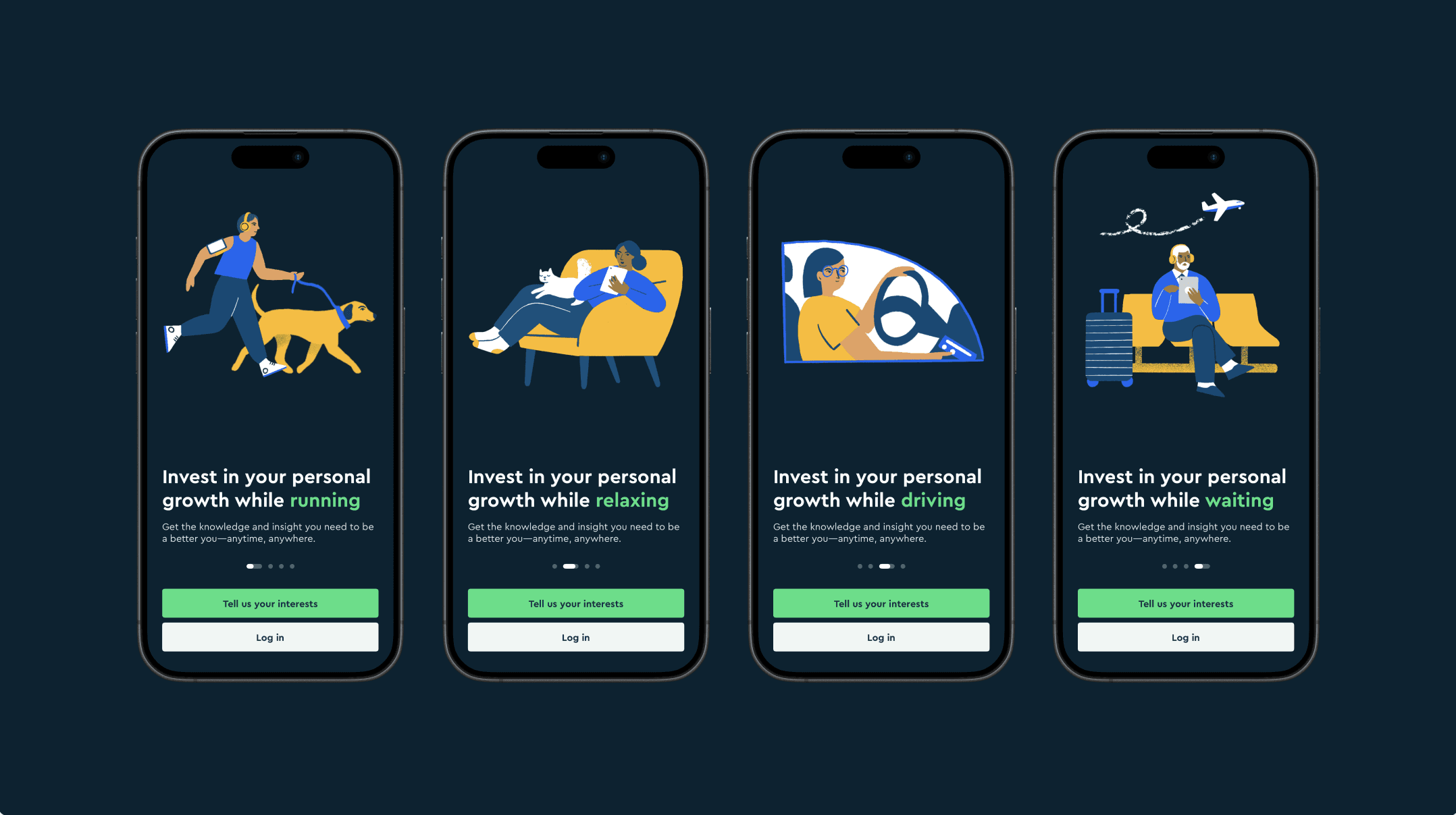
The original intro is a single animated screen that cycles through four lifestyle illustrations every 3 seconds. The headline and CTA never change. Only the illustration changes.
This turns one onboarding moment into a 12-second sequence without introducing meaningful new information. The user experiences movement — but not progression.
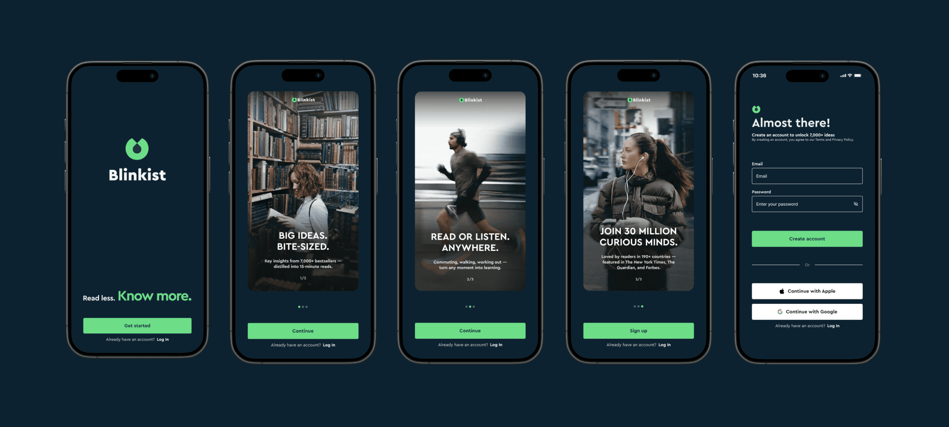
The redesign replaces animated repetition with genuine progression:
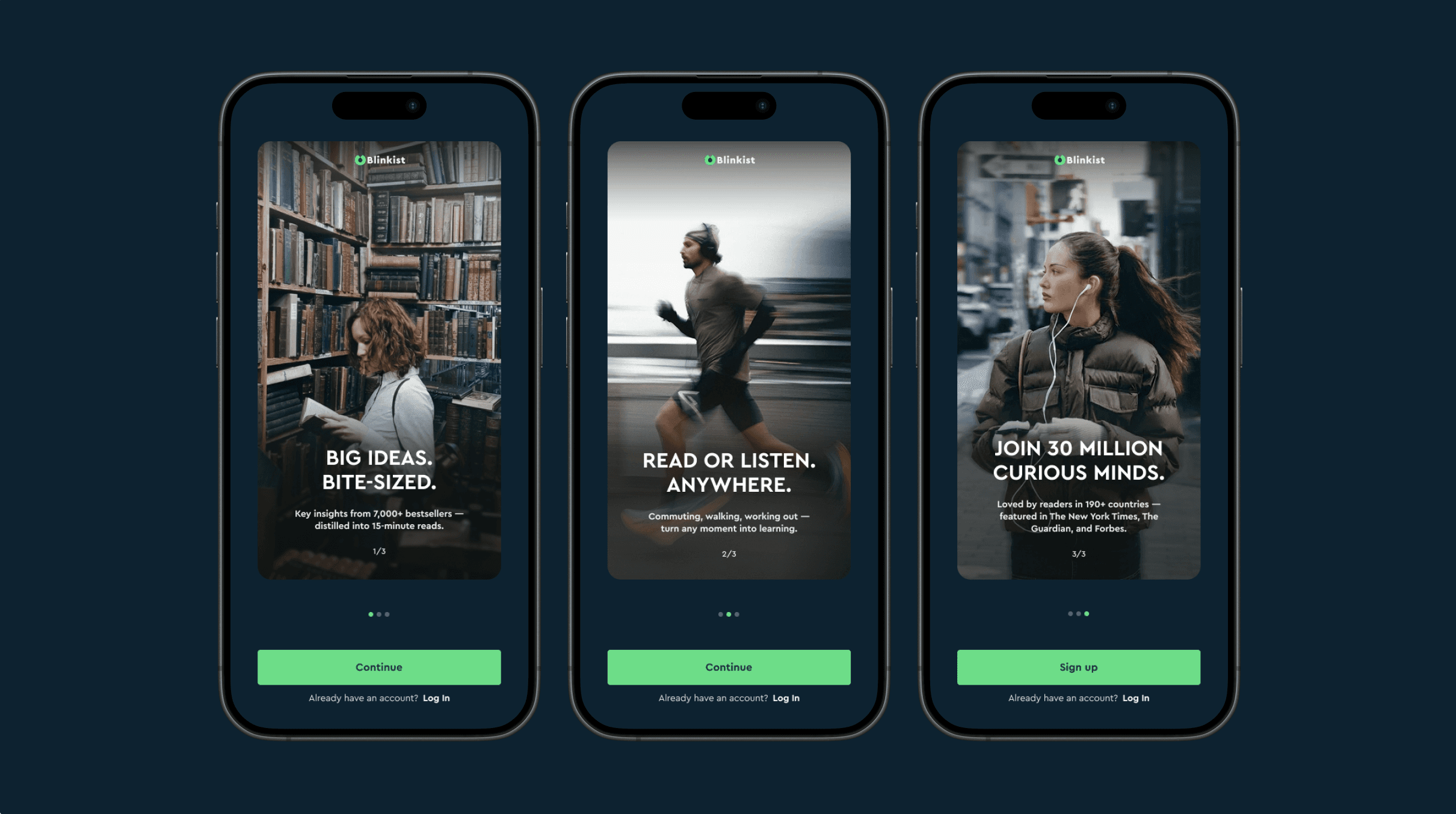
Screen 1 — WHAT What is Blinkist?
Screen 2 — HOW How it works.
Screen 3 — WHO Credibility and social proof.
Three screens. Three jobs. Three reasons to continue.
Visual Direction Exploration
Beyond UX optimization, I proposed a visual evolution: replacing playful illustrations with editorial photography — repositioning Blinkist from a casual learning tool to a premium intellectual product.
This direction may resonate more strongly with users who associate learning with personal growth, ambition, and self-development.
Problem 4: You can't re-engage a user you never captured.
Almost there. And already in the system.
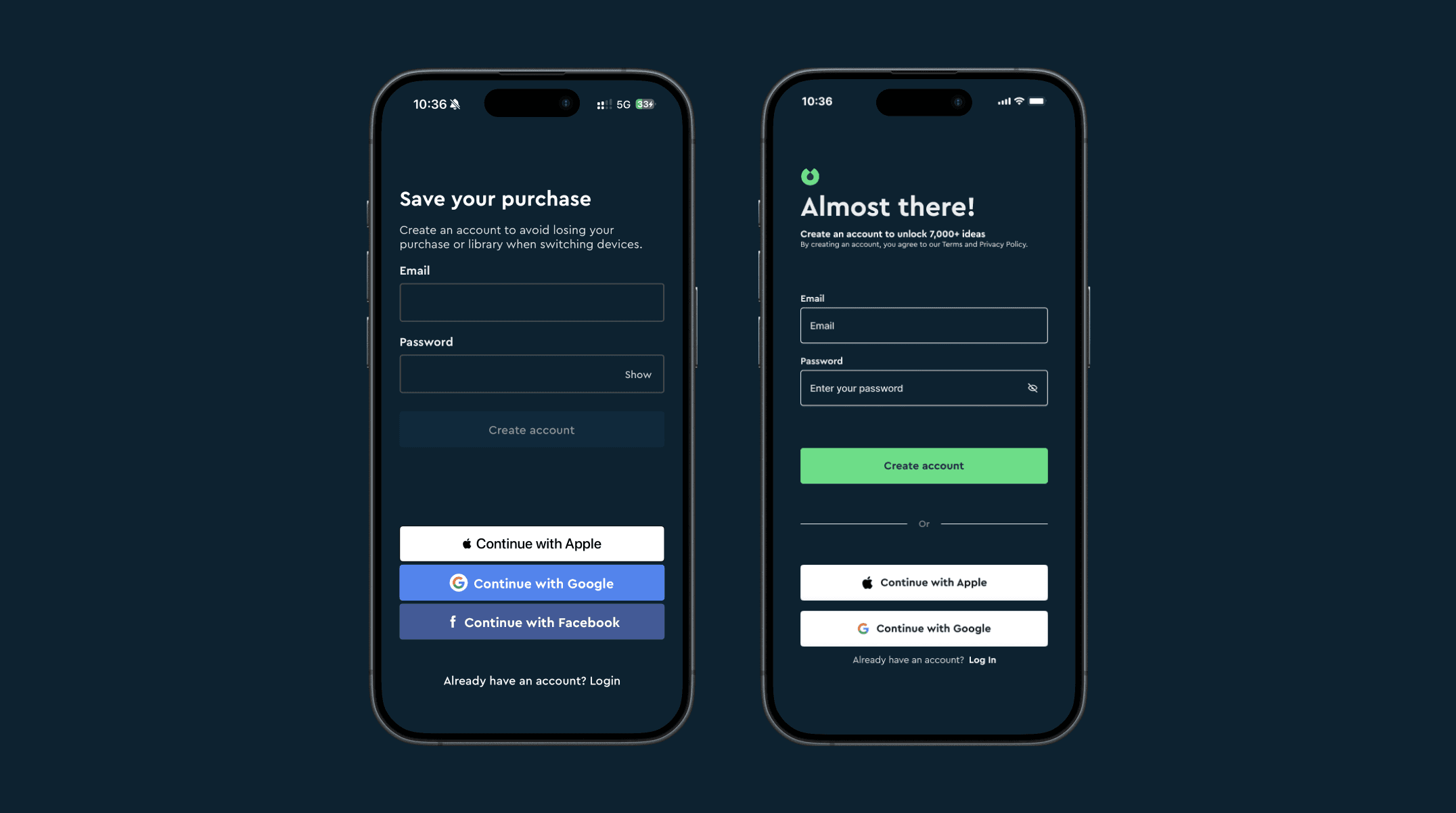
After three intro screens that built understanding and trust, the user reaches this moment already invested —emotionally and cognitively.
Headline shifted from "Save your purchase" (defensive) to "Almost there!" (forward-looking).
Facebook removed — Apple and Google provide faster and more trusted authentication patterns for modern mobile onboarding.
Terms and Privacy Policy disclosure added. Legal requirement in EU, US, and UK. Absent in the original.
Bonus: Pricing moments that may reduce trust
I recognise that pricing decisions involve trade-offs invisible from outside — A/B test results, retention metrics, business constraints. These observations come from a new user's perspective and are shared as something worth examining, not as criticism of the team behind them.
Analysis
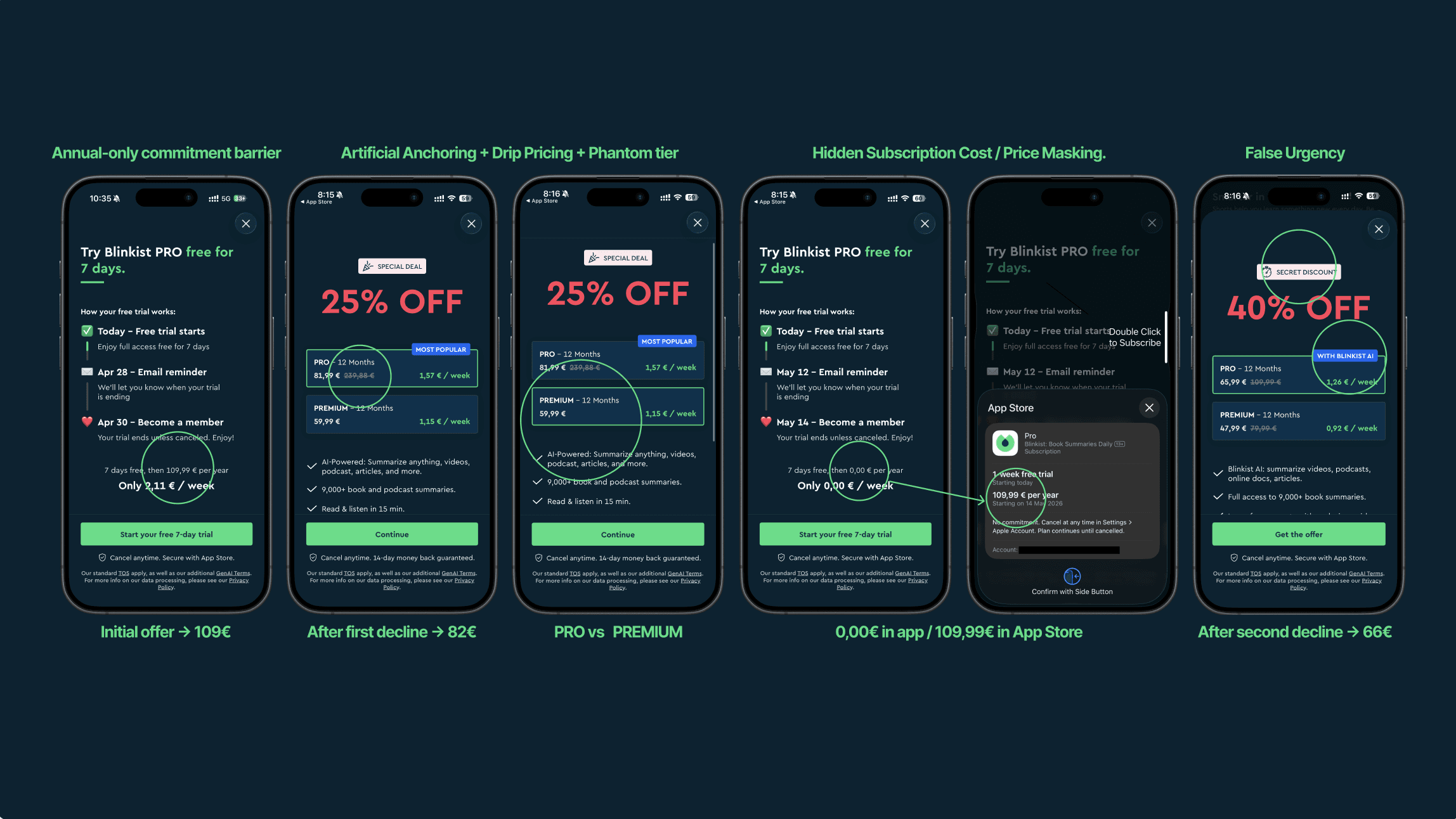
Five dark patterns. One trial that doesn't fix them.
Price masking — UI shows 0,00€, App Store shows 109,99€. Real price appears only in Apple's system dialog. May conflict with EU Omnibus Directive.
Progressive discounting 109€ → 82€ → 66€ after each decline. The initial price was never real.
Artificial anchoring 239,88€ shown as the "original price" — a figure that never existed as an actual plan. Potentially non-compliant with EU Omnibus Directive on price transparency.
Phantom tier PRO and PREMIUM carry different price points but identical functionality. The "MOST POPULAR" badge directs users toward the more expensive option with no additional value delivered.
False urgency "SECRET DISCOUNT" with a clock icon — no expiry date shown, urgency is manufactured.
The 7-day trial solves one problem: converting users who are already inside.
It doesn't solve the earlier one: users who see 109€ upfront and never start. This pre-trial drop-off is invisible in conversion data — but real in acquisition loss.
Proposal:
Transparent tiered pricing from the start.
Monthly (~€9.99) + Annual (~€6.99/month, billed yearly).
Clear price. Clear value. Shown consistently.
Validation Approach
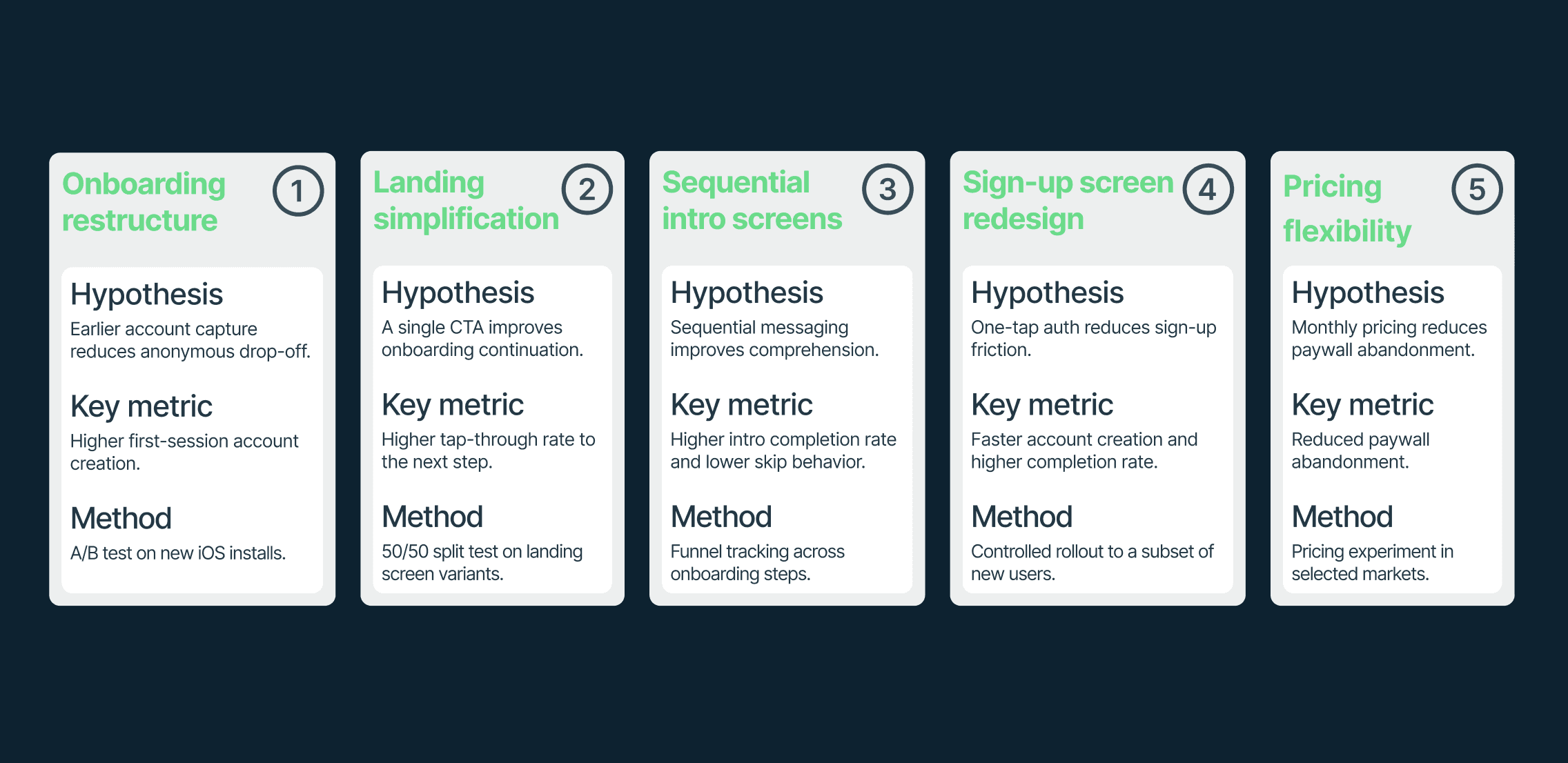
These redesign decisions are presented as product hypotheses — not conclusions.
Outcome
The case study was shared directly with Blinkist’s Co-Founder & CEO as part of an independent product design exploration.
The process reinforced the importance of treating outside-in product analysis carefully — especially when evaluating onboarding, monetization, and activation flows without access to internal data or experimentation history.
More than anything, the project strengthened my interest in strategic UX thinking: understanding how onboarding structure, friction, hierarchy, and behavioral psychology shape product experience beyond the interface itself.
More Projects

UI / UX Design
Blinkist Onboarding Audit & Redesign
A self-initiated UX/UI case study analyzing onboarding friction, cognitive load, and account capture strategy in the Blinkist mobile experience.
Year :
2026
Industry :
EdTech
Client :
Self-initiated redesign concept
Duration :
2 week
Team :
Solo
Challenge :
Blinkist already delivers clear product value. However, the first onboarding session introduces multiple friction points before users fully understand why they should continue. This case study explores how onboarding structure, messaging hierarchy, account timing, and pricing presentation could be simplified to create a clearer path to activation.
PROBLEM DIAGNOSIS
Problem 1: Current onboarding asks too much, too early.
Core insight:
The flow requires visual processing, decision-making, and category selection before delivering value or capturing the account.
The intro is one animated screen with four lifestyle variations. The headline and CTA never change.
The user completes 4 onboarding steps with 30+ selections before sign-up — introducing high cognitive load before value is established.
Drop-off at any point means the user is lost. No email captured means no re-engagement possible.
SOLUTION
Reordering the flow around progressive commitment.
The redesigned flow captures the account earlier and delivers personalisation as a follow-up, not a precondition.
introduce → demonstrate → prove → register → personalize
Many modern consumer apps prioritise account capture early in the onboarding flow, using personalisation as a follow-up rather than a prerequisite.
An incomplete profile remains addressable through email and re-engagement. A lost user does not.
Problem 2: Landing Screen
First screen, first impression, first friction.
12 covers, two equal-weight CTAs, and a generic headline compete for attention before communicating why the user should stay.
Two equal-weight actions create decision friction at the worst moment — before the user understands the product. Hick's Law: more choices, slower decisions.
"Understand powerful ideas in 15 mins" could belong to any learning app. It describes a feature — not a transformation.
The redesign reduces the landing screen to its essential job: create one moment of curiosity, then invite one action.
The Blinkist logo becomes the visual anchor of the screen — reinforcing brand recall, increasing memorability, and creating a cleaner focal point before onboarding begins.
"Read less. Know more." — Shorter, sharper, and easier to remember.
Problem 3: From Slides to Intro
The onboarding creates movement without progression.
The original intro is a single animated screen that cycles through four lifestyle illustrations every 3 seconds. The headline and CTA never change. Only the illustration changes.
This turns one onboarding moment into a 12-second sequence without introducing meaningful new information. The user experiences movement — but not progression.
The redesign replaces animated repetition with genuine progression:
Screen 1 — WHAT What is Blinkist?
Screen 2 — HOW How it works.
Screen 3 — WHO Credibility and social proof.
Three screens. Three jobs. Three reasons to continue.
Visual Direction Exploration
Beyond UX optimization, I proposed a visual evolution: replacing playful illustrations with editorial photography — repositioning Blinkist from a casual learning tool to a premium intellectual product.
This direction may resonate more strongly with users who associate learning with personal growth, ambition, and self-development.
Problem 4: You can't re-engage a user you never captured.
Almost there. And already in the system.
After three intro screens that built understanding and trust, the user reaches this moment already invested —emotionally and cognitively.
Headline shifted from "Save your purchase" (defensive) to "Almost there!" (forward-looking).
Facebook removed — Apple and Google provide faster and more trusted authentication patterns for modern mobile onboarding.
Terms and Privacy Policy disclosure added. Legal requirement in EU, US, and UK. Absent in the original.
Bonus: Pricing moments that may reduce trust
I recognise that pricing decisions involve trade-offs invisible from outside — A/B test results, retention metrics, business constraints. These observations come from a new user's perspective and are shared as something worth examining, not as criticism of the team behind them.
Analysis
Five dark patterns. One trial that doesn't fix them.
Price masking — UI shows 0,00€, App Store shows 109,99€. Real price appears only in Apple's system dialog. May conflict with EU Omnibus Directive.
Progressive discounting 109€ → 82€ → 66€ after each decline. The initial price was never real.
Artificial anchoring 239,88€ shown as the "original price" — a figure that never existed as an actual plan. Potentially non-compliant with EU Omnibus Directive on price transparency.
Phantom tier PRO and PREMIUM carry different price points but identical functionality. The "MOST POPULAR" badge directs users toward the more expensive option with no additional value delivered.
False urgency "SECRET DISCOUNT" with a clock icon — no expiry date shown, urgency is manufactured.
The 7-day trial solves one problem: converting users who are already inside.
It doesn't solve the earlier one: users who see 109€ upfront and never start. This pre-trial drop-off is invisible in conversion data — but real in acquisition loss.
Proposal:
Transparent tiered pricing from the start.
Monthly (~€9.99) + Annual (~€6.99/month, billed yearly).
Clear price. Clear value. Shown consistently.
Validation Approach
These redesign decisions are presented as product hypotheses — not conclusions.
Outcome
The case study was shared directly with Blinkist’s Co-Founder & CEO as part of an independent product design exploration.
The process reinforced the importance of treating outside-in product analysis carefully — especially when evaluating onboarding, monetization, and activation flows without access to internal data or experimentation history.
More than anything, the project strengthened my interest in strategic UX thinking: understanding how onboarding structure, friction, hierarchy, and behavioral psychology shape product experience beyond the interface itself.
More Projects
UI / UX Design
Blinkist Onboarding Audit & Redesign
A self-initiated UX/UI case study analyzing onboarding friction, cognitive load, and account capture strategy in the Blinkist mobile experience.
Year :
2026
Industry :
EdTech
Client :
Self-initiated redesign concept
Duration :
2 week
Team :
Solo
Challenge :
Blinkist already delivers clear product value. However, the first onboarding session introduces multiple friction points before users fully understand why they should continue. This case study explores how onboarding structure, messaging hierarchy, account timing, and pricing presentation could be simplified to create a clearer path to activation.
PROBLEM DIAGNOSIS
Problem 1: Current onboarding asks too much, too early.
Core insight:
The flow requires visual processing, decision-making, and category selection before delivering value or capturing the account.
The intro is one animated screen with four lifestyle variations. The headline and CTA never change.
The user completes 4 onboarding steps with 30+ selections before sign-up — introducing high cognitive load before value is established.
Drop-off at any point means the user is lost. No email captured means no re-engagement possible.
SOLUTION
Reordering the flow around progressive commitment.
The redesigned flow captures the account earlier and delivers personalisation as a follow-up, not a precondition.
introduce → demonstrate → prove → register → personalize
Many modern consumer apps prioritise account capture early in the onboarding flow, using personalisation as a follow-up rather than a prerequisite.
An incomplete profile remains addressable through email and re-engagement. A lost user does not.
Problem 2: Landing Screen
First screen, first impression, first friction.
12 covers, two equal-weight CTAs, and a generic headline compete for attention before communicating why the user should stay.
Two equal-weight actions create decision friction at the worst moment — before the user understands the product. Hick's Law: more choices, slower decisions.
"Understand powerful ideas in 15 mins" could belong to any learning app. It describes a feature — not a transformation.
The redesign reduces the landing screen to its essential job: create one moment of curiosity, then invite one action.
The Blinkist logo becomes the visual anchor of the screen — reinforcing brand recall, increasing memorability, and creating a cleaner focal point before onboarding begins.
"Read less. Know more." — Shorter, sharper, and easier to remember.
Problem 3: From Slides to Intro
The onboarding creates movement without progression.
The original intro is a single animated screen that cycles through four lifestyle illustrations every 3 seconds. The headline and CTA never change. Only the illustration changes.
This turns one onboarding moment into a 12-second sequence without introducing meaningful new information. The user experiences movement — but not progression.
The redesign replaces animated repetition with genuine progression:
Screen 1 — WHAT What is Blinkist?
Screen 2 — HOW How it works.
Screen 3 — WHO Credibility and social proof.
Three screens. Three jobs. Three reasons to continue.
Visual Direction Exploration
Beyond UX optimization, I proposed a visual evolution: replacing playful illustrations with editorial photography — repositioning Blinkist from a casual learning tool to a premium intellectual product.
This direction may resonate more strongly with users who associate learning with personal growth, ambition, and self-development.
Problem 4: You can't re-engage a user you never captured.
Almost there. And already in the system.
After three intro screens that built understanding and trust, the user reaches this moment already invested —emotionally and cognitively.
Headline shifted from "Save your purchase" (defensive) to "Almost there!" (forward-looking).
Facebook removed — Apple and Google provide faster and more trusted authentication patterns for modern mobile onboarding.
Terms and Privacy Policy disclosure added. Legal requirement in EU, US, and UK. Absent in the original.
Bonus: Pricing moments that may reduce trust
I recognise that pricing decisions involve trade-offs invisible from outside — A/B test results, retention metrics, business constraints. These observations come from a new user's perspective and are shared as something worth examining, not as criticism of the team behind them.
Analysis
Five dark patterns. One trial that doesn't fix them.
Price masking — UI shows 0,00€, App Store shows 109,99€. Real price appears only in Apple's system dialog. May conflict with EU Omnibus Directive.
Progressive discounting 109€ → 82€ → 66€ after each decline. The initial price was never real.
Artificial anchoring 239,88€ shown as the "original price" — a figure that never existed as an actual plan. Potentially non-compliant with EU Omnibus Directive on price transparency.
Phantom tier PRO and PREMIUM carry different price points but identical functionality. The "MOST POPULAR" badge directs users toward the more expensive option with no additional value delivered.
False urgency "SECRET DISCOUNT" with a clock icon — no expiry date shown, urgency is manufactured.
The 7-day trial solves one problem: converting users who are already inside.
It doesn't solve the earlier one: users who see 109€ upfront and never start. This pre-trial drop-off is invisible in conversion data — but real in acquisition loss.
Proposal:
Transparent tiered pricing from the start.
Monthly (~€9.99) + Annual (~€6.99/month, billed yearly).
Clear price. Clear value. Shown consistently.
Validation Approach
These redesign decisions are presented as product hypotheses — not conclusions.
Outcome
The case study was shared directly with Blinkist’s Co-Founder & CEO as part of an independent product design exploration.
The process reinforced the importance of treating outside-in product analysis carefully — especially when evaluating onboarding, monetization, and activation flows without access to internal data or experimentation history.
More than anything, the project strengthened my interest in strategic UX thinking: understanding how onboarding structure, friction, hierarchy, and behavioral psychology shape product experience beyond the interface itself.